
Modern embedded systems increasingly rely on interactive user interfaces to provide configuration options, parameter settings, and real-time controls. Whether it is an automotive infotainment system, industrial control panel, medical device, or smart appliance, users frequently need to adjust numerical values directly from the display.
While keyboards and touch-based numeric entry fields are common in larger systems, many embedded devices require a simpler and more controlled approach to value modification. In such cases, incrementing or decrementing values through dedicated controls offers a more intuitive and reliable user experience.
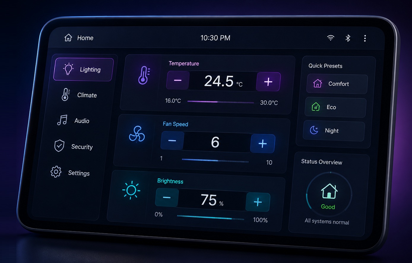
The StepInput Widget in Sparklet is designed specifically for this purpose. It enables users to increase or decrease numerical values through predefined increment and decrement controls while ensuring that values remain within acceptable limits. With support for integer and floating-point values, configurable ranges, and data binding capabilities, the widget provides a practical solution for many embedded UI scenarios.
In this article, we explore the StepInput Widget, its key properties, and how it can be used to build user-friendly embedded interfaces.
Why Controlled Numeric Input Matters
Many embedded applications involve parameters that must stay within a defined range. Allowing unrestricted manual entry can increase the possibility of invalid values and complicate validation logic. For example, consider settings such as:
- Audio volume levels
- Temperature setpoints
- Brightness adjustments
- Industrial process parameters
In these scenarios, users typically need to make small adjustments rather than entering entirely new values. A step-based control mechanism simplifies interaction while reducing input errors.
The StepInput Widget addresses this requirement by providing dedicated increment and decrement controls that allow users to adjust values in a controlled and predictable manner.
What is the StepInput Widget?
The StepInput Widget is a specialized UI component that allows users to modify numerical values using increment and decrement actions.
The widget typically consists of:
- An increment control
- A decrement control
- A numeric value display
When users interact with the increment area, the displayed value increases according to the configured step count. Similarly, interacting with the decrement area reduces the value.
The widget is linked to an application data variable through data mapping, ensuring that changes made through the UI are reflected in the underlying application data.
This makes the StepInput Widget ideal for embedded systems where parameter control needs to be simple, reliable, and constrained.
Visual Configuration in Sparklet UI Designer
One of the advantages of Sparklet UI Designer is its visual development approach. After dragging and dropping the StepInput Widget onto the design canvas, developers can customize its appearance by assigning images for: Increment action and Decrement action
These images can be designed to match the overall product theme and branding requirements.
The displayed numeric value is rendered through a text layer and mapped to an application data variable. This ensures that the visual representation remains synchronized with the actual application value.
By combining graphical controls with data binding, developers can create intuitive numeric adjustment interfaces without extensive coding effort.
Configurable Value Management
The StepInput Widget provides several configuration options that help developers control user interaction.
One of the most important settings is the minimum and maximum value range. These properties ensure that users cannot exceed acceptable operating limits. For example:
- Temperature setting: 16°C to 30°C
- Volume level: 0 to 100
- Fan speed: 1 to 10
By enforcing boundaries at the widget level, developers can prevent invalid inputs and improve system reliability.
Another useful property is the step count, which determines how much the value changes during each increment or decrement operation.
Depending on the application, the step value may represent:
- 1 unit increase
- 5 unit increase
- 0.5 decimal increase
- Custom application-specific increments
This flexibility allows the widget to support a wide variety of embedded use cases.
Increment and Decrement Trigger Regions
The widget also provides configurable increment and decrement trigger points.
These properties define the screen regions that respond to user interaction.
By configuring start and end points for increment and decrement areas, developers can fine-tune how user input is detected.
This is particularly useful in:
- Touchscreen applications
- Custom-shaped controls
- Compact embedded displays
The flexibility allows developers to align interaction zones with custom graphics and product-specific UI layouts.
Real-World Use Cases
Automotive Systems
Vehicle settings often require precise value adjustment. Examples include:
- Cabin temperature
- Display brightness
- Audio volume
- Driver preference settings
The StepInput Widget provides a familiar and controlled interaction method for these functions.
Industrial HMIs
Industrial operators frequently adjust machine parameters. Examples include:
- Speed settings
- Pressure limits
- Production counts
- Process timers
Using step-based input helps minimize configuration errors.
Medical Devices
Medical equipment often requires carefully controlled value selection. Examples include:
- Dosage configuration
- Alarm thresholds
- Monitoring intervals
The widget enables predictable and validated parameter adjustments.
Smart Appliances
Home appliances frequently use increment/decrement controls for settings such as:
- Cooking temperature
- Wash cycle duration
- Fan speed
- Brightness control
The StepInput Widget offers a clean and user-friendly solution for these interactions.
Benefits of Using StepInput Widget
The StepInput Widget delivers several advantages for embedded UI development.
It simplifies user interaction by providing a straightforward method for modifying values. It reduces input errors by enforcing value limits and controlled increments. It supports both integer and decimal values, making it suitable for a broad range of applications.
Additionally, its integration with Sparklet's data model ensures seamless synchronization between user interface elements and application data.
These capabilities make the widget a practical choice for developers building reliable and intuitive embedded interfaces.
Conclusion
Numeric value adjustment is a common requirement across embedded systems, and providing users with a simple, reliable interaction method is essential for creating a positive user experience.
The StepInput Widget in Sparklet offers an efficient solution by combining configurable increment and decrement controls, value range management, floating-point support, and seamless data integration.
Whether used in automotive systems, industrial HMIs, medical devices, or smart appliances, the widget helps developers build intuitive interfaces that allow users to adjust parameters confidently and accurately.
By leveraging the StepInput Widget, embedded UI designers can create cleaner, safer, and more user-friendly value adjustment workflows while reducing development complexity.
https://sparkletui.com/documentation/flint-ui-designer/widgets/widgets.html#stepinput-widget