From basic buttons and sliders to real-time graphs, 3D widgets, and fully animated carousels — Sparklet's embedded GUI widget library covers every MCU and MPU display use case. MISRA C compliant. Hardware-accelerated. Drag-and-drop ready in Flint UI Designer.
An embedded GUI widget library is a collection of pre-built user interface components — buttons, sliders, graphs, meters, lists, and containers — that developers use to assemble display screens on microcontrollers (MCUs) and microprocessors (MPUs). Rather than drawing every pixel from scratch, engineers configure and compose widgets to build complete HMIs in hours, not weeks.
Sparklet ships with 36+ production-ready widgets across four categories: input controls, data visualisation, container and navigation, and advanced 3D components. Every widget is written in pure C, MISRA C compliant, hardware-accelerated where the platform supports it, and fully configurable through Flint UI Designer — Sparklet's no-code WYSIWYG design tool — without writing a single line of layout code.
This page covers the complete Sparklet widget catalogue, how each category is used across industries, and what sets Sparklet's widget quality apart from open-source and competing commercial frameworks. For platform-specific widget performance benchmarks, see the Performance & Memory page.
Every widget shares the same rendering pipeline, event model, and property API. Mix and compose across categories without integration overhead. All categories are available as first-class components in Flint UI Designer's drag-and-drop palette.
Button (Push, Toggle, Radio), CheckBox, Slider, RotaryKnob, TextEdit, SwipeButton — all touch- and encoder-ready with configurable visual states for idle, pressed, focused, and disabled.
Graph (Line, Bar, Range), Meter, ProgressBar (linear and circular), Clock, TextArea, Static — designed for real-time data display on medical monitors, automotive clusters, and industrial dashboards.
Window, Dialog, ScrollView, GridView, Carousel, DotNavigator, FixedView, Holder, Viewport, ScrollBar, MsgBox, ListBox, ListView, ComboBox, Menu, Tab, TaskBar — structural building blocks for every screen layout.
3DWidget, 3DView, Keyboard, KeyboardKey, CustomWidget — for applications requiring 3D model rendering, on-screen keyboard integration, or fully bespoke UI components unique to a product.
Sparklet's input widget set covers every control interaction needed on a touchscreen or encoder-driven embedded display — from momentary button presses to continuous value adjustment and free-text entry.
Three specialised button variants cover every action pattern. Push Button triggers an immediate action on press or release — ideal for Start, Stop, Confirm, or screen navigation. Toggle Button maintains state between presses (On/Off, Enable/Disable, Mute) with distinct visuals per state. Radio Button enforces single-selection within a group, auto-deselecting the previous choice — essential for mode selection, unit switching, or configuration menus. All three types support fully customisable visual states (idle, pressed, focused, disabled) and can be styled with text, icons, or image fills.

The Slider widget lets users select a value from a continuous range by dragging a handle along a track. Available in horizontal and vertical orientations. Configurable min/max range, step size, and fill colour. Used for volume, brightness, temperature, and speed controls. Supports both touch drag and encoder-based increment. The SLD widget API provides four event sub-types — press, drag, release, value-change — enabling precise application response at every interaction stage.

The RotaryKnob widget renders a skeuomorphic dial control for adjusting values by rotating a virtual knob — ideal for applications that mimic physical controls such as audio equalisers, HVAC thermostats, and instrument cluster settings. Supports configurable start/end angle, min/max value, and directional touch or encoder input. Smooth angular animation is rendered entirely in software, with optional hardware-acceleration on platforms with 2D GPU support. A natural fit for automotive HMI and industrial control panels.

The TextEdit widget provides a configurable text input field that integrates directly with Sparklet's Keyboard and KeyboardKey widgets. Flint ships pre-built QWERTY and numeric OSK layouts — both fully customisable for language, branding, and key mapping. On activation, the keyboard appears automatically and dismisses on commit or cancel. Supports password masking, max-length enforcement, and placeholder text. Used in appliance PIN entry, industrial login screens, and medical device patient ID fields.

CheckBox provides binary state selection — checked or unchecked — with configurable tick icons and label text. Supports grouped multi-select patterns for settings screens. SwipeButton is a slide-to-confirm control used for safety-critical actions (e.g., start engine, initiate purge, confirm wipe) where accidental activation must be prevented. The user drags a thumb across the full track to confirm, preventing single-tap false triggers common on vibration-prone industrial hardware.

Sparklet's data visualisation widgets are purpose-built for the embedded context: minimal RAM allocation, hardware-accelerated rendering where available, and configurable update rates suitable for real-time sensor feeds and live telemetry.
The Graph widget renders Line Charts, Bar Graphs, and Range (area) Graphs from live or historical data arrays. Configurable axes, grid lines, tick marks, data series colours, and legend labels make it suitable for medical patient monitors, industrial SCADA dashboards, and fitness tracker displays. Multiple data series can overlay on a single graph. Update is triggered by a single API call — the widget handles dirty-region invalidation and redraws only the changed portion of the chart, keeping frame rates high even with continuous sensor data. This is the chart widget embedded display engineers most frequently request.

The Meter widget renders a circular gauge — speedometer, tachometer, pressure dial, battery level indicator — with a configurable needle, arc, tick marks, and colour-coded zones (green/yellow/red). Needle sweep is animated and GPU-assisted on accelerated platforms. Fully configurable value range, scale divisions, and label formatting. A standard component in automotive instrument clusters, medical vital sign displays, and industrial process monitors. The Sparklet Meter widget is designed for precise, low-latency needle updates driven directly from hardware sensor interrupts or RTOS queue messages.

The ProgressBar widget comes in two forms: Linear (horizontal or vertical fill bar) and Circular (radial arc fill). Both support percentage-based or value-range modes. Linear progress bars are used for file transfer progress, installation status, and battery charge indication. Circular variants are used for compact dashboards, wearable device charge displays, and loading indicators where screen real estate is limited. This is one of the most frequently used progress bar widget MCU implementations — optimised to render with a single fill-rect or arc draw operation per frame.

The Clock widget renders an analog clockface with configurable hour, minute, and second hands, tick marks, and dial artwork. Hand rotation is calculated from a time value provided by the application — Sparklet does not manage RTC directly; the application feeds current time via the widget API. Ideal for home automation control panels, industrial operator stations, and consumer appliance displays. The clock face artwork, hand shapes, and colours are all set through Flint Designer as standard image and colour properties — no code required to style.

Static is the fundamental read-only display widget — a configurable text label with full font, colour, alignment, and overflow control (clip, ellipsis, marquee scrolling). Used for titles, status text, sensor readouts, and unit labels everywhere on a display. TextArea is the multi-line scrollable text display — used for log outputs, notifications, descriptive panels, and manual pages within embedded applications. Both widgets support Unicode and multi-language content when used with Sparklet's multi-language font engine.

Container widgets define the structural layout of every screen. They manage child widget positioning, scrolling, layering, and navigation flow — without requiring manual coordinate calculations.
ScrollView is Sparklet's primary scrollable container — it wraps a single child widget (typically a FixedView or GridView) and provides smooth horizontal or vertical scrolling when content exceeds the visible area. Two internal ScrollBar widgets are managed automatically. Viewport clips rendering to the visible region, ensuring content outside the scroll window never consumes render cycles. This combination is the backbone of list screens, settings menus, and long-form content displays on embedded devices with small physical screens.

GridView arranges child widgets in a configurable row-and-column grid layout — supporting both fixed-size cells and proportional allocation. Used for icon grids, app launchers, settings dashboards, and product catalogues on appliance displays. Supports horizontal and vertical scroll directions. Sparklet's GridView handles child widget creation, positioning, and recycling automatically as the user scrolls, keeping RAM usage bounded regardless of grid content count.

The Carousel widget presents a horizontally or vertically swipeable collection of views — product images, onboarding screens, mode selector panels, or feature highlights. Smooth paged scrolling with inertia and snap animation. The DotNavigator widget renders the familiar pager dots aligned to the active carousel page, updating automatically as the user swipes. This Carousel + DotNavigator pairing is the standard pattern for home screens on smart appliances, wearable setup flows, and consumer electronics mode selection.

Dialog presents a modal overlay window for confirmations, alerts, and user prompts — interrupting the main UI flow and requiring an explicit user action to dismiss. Supports configurable button sets, custom content areas, and callback functions on button press. MsgBox is a lighter-weight non-modal notification popup for transient messages (success, warning, error) that auto-dismiss after a configurable timeout or on tap. Both are essential for safety-critical applications where the operator must acknowledge critical state changes before proceeding.

Tab provides a tabbed navigation bar that switches between content panels — the standard pattern for multi-section settings screens, feature dashboards, and instrument cluster view modes. Menu renders a hierarchical dropdown or sidebar navigation structure. ListBox and ListView render scrollable selection lists with single or multi-select modes — used for file selectors, device lists, network SSIDs, and configuration option pickers. ComboBox combines a collapsed display with a dropdown list, saving screen space in dense configuration UIs.

Sparklet's 3DWidget and 3DView components bring three-dimensional model rendering directly into the embedded GUI widget tree — without a separate 3D engine integration layer. Import .obj or .fbx model files through Flint UI Designer; the asset pipeline converts and optimises geometry for the target platform. On MPUs running Linux with OpenGL ES or Vulkan, the 3D widget renders at full GPU-accelerated frame rates. On capable MCUs, a software-based 3D renderer handles the same widget transparently.
Use cases include digital twin dashboards showing 3D product models, automotive instrument clusters with 3D needle and dial effects, and medical device displays with anatomical reference overlays. The 3DView widget provides the camera, lighting, and scene management; 3DWidget is the individual renderable object placed within a scene. See the 3D Graphics & Widgets page for full platform capability matrix.
CustomWidget is the Sparklet escape hatch for UI elements that no pre-built widget satisfies. It provides a registered draw callback, an event callback, and a property map — the same interfaces used by every built-in widget. Custom widgets integrate seamlessly into the Flint Designer property inspector and layout system; once registered, a custom widget is treated identically to a built-in one. This means teams can build proprietary gauge styles, brand-specific controls, or application-specific visualisations and deploy them through Flint's drag-and-drop environment like any standard component. Custom widgets are fully hardware-acceleration aware — the draw callback receives the same GDI context as built-in widgets, giving access to DMA2D, D/AVE2D, and Mali GPU drawing primitives.
The Keyboard widget is a configurable on-screen keyboard container. KeyboardKey is the individual key component within it. Together they form a flexible OSK system: Flint ships default QWERTY and numeric layouts, but any custom layout — regional character sets, function-key panels, calculator pads, industrial shortcut bars — can be assembled by adding KeyboardKey widgets to a Keyboard container in the designer. The Keyboard widget automatically connects to focused TextEdit widgets, manages shift/caps state, and fires character-entry events to the application layer.
| Widget | Category | Key Properties | Hardware Accel | Events |
|---|---|---|---|---|
| Button (Push/Toggle/Radio) | Input | Label, icon, states, style | Yes (blit) | Press, Release, Value-change |
| Slider | Input | Range, orientation, step | Yes (fill) | Press, Drag, Release, Value-change |
| RotaryKnob | Input | Angle range, value range | Yes (rotate) | Rotate, Release, Value-change |
| Graph (Line/Bar/Range) | Data Viz | Axes, series, grid, legend | Yes (line draw) | Data-update |
| Meter | Data Viz | Needle, arc, zones, scale | Yes (arc, rotate) | Value-change |
| ProgressBar | Data Viz | Min/max, orientation, type | Yes (fill-rect, arc) | Value-change |
| ScrollView | Container | Axis, scroll speed, inertia | Yes (blit) | Scroll, Scroll-end |
| Carousel | Container | Orientation, snap, inertia | Yes (blit) | Swipe, Page-change |
| Dialog | Container | Buttons, content, modal | No | Button-press, Dismiss |
| 3DWidget | Advanced | .obj/.fbx model, material | GPU (OpenGL ES / Vulkan) | Rotate, Scale, Tap |
| CustomWidget | Advanced | Custom draw/event callbacks | Full GDI access | All via callback |

Every widget in Sparklet's library is written to MISRA C standards — a hard requirement for automotive (ISO 26262), medical (IEC 62304), and safety-critical industrial HMIs. LVGL, TouchGFX, and emWin do not offer full MISRA C compliance across their widget codebase.

Widgets delegate fill, blit, alpha blend, and rotate operations to platform-specific 2D hardware (DMA2D on STM32, D/AVE2D on Renesas, Mali GPU on RA8D1 and i.MX 8) automatically. The same widget code achieves 60fps on accelerated platforms and degrades gracefully to software rendering on bare MCUs — no code changes required.

Every widget property — position, size, opacity, colour, value — supports keyframe animation through Flint's animation timeline. Smooth state transitions, easing curves, and sequenced multi-widget animations are configured in the designer, not coded. Animated widgets run through Sparklet's execution engine without consuming extra RAM for animation buffers.

Every widget is a first-class Flint Designer component. Drag onto canvas, configure properties visually, connect to state machines and data bindings, export optimised C code. No manual coordinate calculations, no layout XML, no separate widget configuration step. From first widget placement to compiled, running embedded UI in under a day.

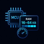
Widget instances carry only the state data they need. Sparklet's widget allocator is configurable — applications include only the widget types they use, keeping Flash size bounded. The full widget library runs in as little as 16 KB RAM for simple single-screen applications, scaling to 200 KB for complex multi-screen HMIs with animation and data binding.

The Sparklet widget API is identical on Renesas RH850, NXP i.MX RT1170, STM32H7, Infineon TRAVEO, Nuvoton, Rockchip, and the Windows/Linux PC simulator. Code written and tested in the simulator runs unmodified on target hardware. Platform-specific GPU calls are handled entirely inside the rendering layer — widget code never contains hardware-specific branches.
Sparklet includes 36+ widgets across four categories. Input and control: Button (Push, Toggle, Radio), CheckBox, Slider, RotaryKnob, TextEdit, SwipeButton. Data visualisation: Graph (Line, Bar, Range), Meter, ProgressBar (linear and circular), Clock, Static, TextArea, ImageHolder. Container and navigation: Window, Dialog, ScrollView, GridView, Carousel, DotNavigator, FixedView, Holder, Viewport, ScrollBar, MsgBox, ListBox, ListView, ComboBox, Menu, Tab, TaskBar. Advanced: 3DWidget, 3DView, Keyboard, KeyboardKey, CustomWidget.
Download the Sparklet evaluation binary and Flint UI Designer. Explore the full 36+ widget catalogue in the Windows PC simulator — no target hardware required. Build your first embedded UI screen today.