
As embedded systems evolve, they are increasingly expected to deliver polished, modern user experiences similar to mobile or desktop applications. A fundamental part of this experience is the effective presentation of dynamic, structured information. Among the most widely used and intuitively understood layout patterns is the List View.
A List View allows developers to organize content in a linear manner—either vertically or horizontally—making it an essential GUI widget for efficient data browsing, navigation, and interaction. In this article, we explore the significance of List Views in UI design, present common real-world use cases, and introduce the Sparklet ListView Widget, which is optimized for performance and flexibility in embedded applications.
Role of List Views in Embedded UI Design
A List View arranges multiple items—text, icons, buttons, or composite controls—in a scrollable sequence, making it ideal for:
- Displaying dynamic datasets
- Navigating through categories
- Listing options, logs, or notifications
- Presenting user actions or menus
Unlike grid views that prioritize visual uniformity, list views emphasize hierarchy and linearity. This makes them particularly effective when item order is meaningful, or when each item contains additional contextual information.
Key benefits include:
- Clear readability: Easy to scan from top to bottom or left to right.
- Compact layout: Ideal for limited screen real estate.
- Dynamic content: Supports items of varying length and height.
- User familiarity: Matches common patterns from mobile UIs.
Real-World Use Cases for List Views
List Views are used extensively in embedded systems across domains:
- Industrial Interfaces: In industrial interfaces, they are often used for displaying event logs, alarm notifications, and real-time machine or sensor status updates.
- Medical Equipment: Within medical equipment, list views play a crucial role in managing patient records, showing test results, and navigating through diagnostic options.
- Smart Appliances: Smart appliances also make extensive use of list views, whether it is for presenting recipes, choosing cycle modes in washing machines, or reviewing schedules, reminders, and device history logs.
- Consumer Electronics: In consumer electronics, they enable smooth navigation through menus, settings, and media libraries, while also providing quick access to recent files or activity history.
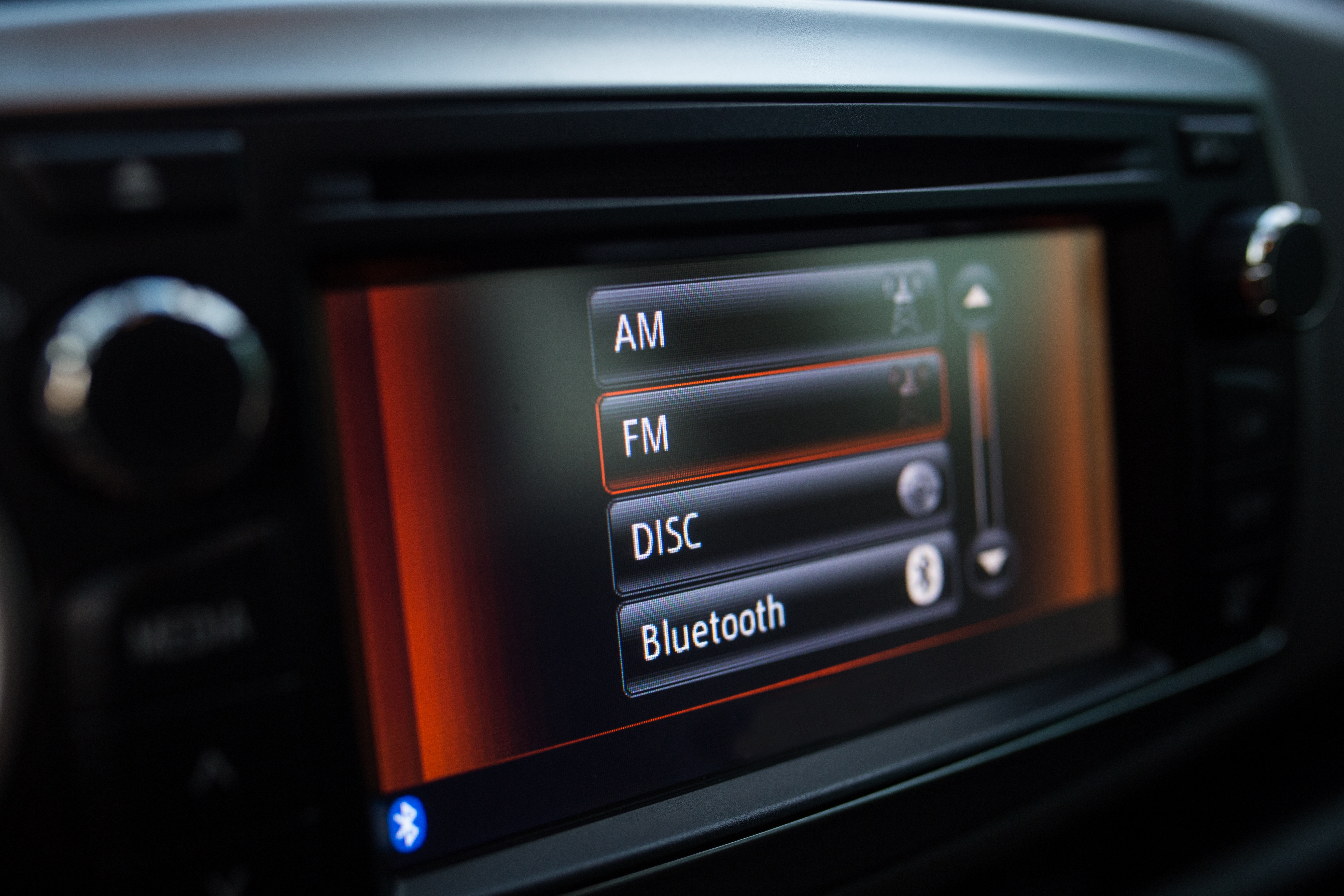
- Automotive Systems: Automotive systems rely on list views to display vehicle information, trip summaries, service alerts, and lists of media stations or paired devices.
- Retail & Kiosks: In retail and kiosk applications, they are used to browse product categories, review transaction logs, monitor inventory, or even manage queues and customer requests.
Wherever multiple similar items need to be displayed in an orderly and easy-to-navigate manner, list views serve as the go-to layout, ensuring efficiency and user-friendly interaction across domains.
Introducing the Sparklet ListView Widget
The Sparklet ListView Widget is a purpose-built GUI widget for embedded systems that need to display lists in a memory-efficient, high-performance format. It supports a wide variety of customization features, interaction models, and rendering optimizations.
Orientation Flexibility: Vertical and Horizontal Layouts
Sparklet allows developers to choose the best fit for their interface design:
- Vertical List View: Ideal for log views, menus, and scrolling content
- Horizontal List View: Perfect for tab menus, image carousels, or card-style item browsers
Switching orientation is as simple as a configuration change, allowing you to reuse components across different UIs.
Custom Item Templates and Layouts
Each list item can be tailored to include:
- Text labels, icons, progress bars, or buttons.
- Composite controls such as toggles or sliders.
- Variable height or width items for dynamic content display.
Developers can define item styles, content alignment, padding, and spacing—providing full control over the user experience.
Theming and Visual Customization
The Sparklet ListView Widget supports robust theming capabilities:
- Light and Dark Modes: Adapt UI to ambient conditions or user preferences.
- State-based Styling: Modify appearance for selected, highlighted, or disabled items.
- Animated Transitions: Smooth in/out or highlight effects during item updates.
Themes can be easily defined, switched dynamically, and extended across the entire Sparklet UI toolkit for a unified interface design.
Touch and Input Event Handling
Interactivity is core to user engagement. Sparklet enables:
- Tap/click-to-select on list items
- Swipe gestures for scrolling (vertical or horizontal)
- Long press or double-tap support for advanced interaction
The widget includes support for hardware buttons, capacitive touch, or remote control interfaces, making it suitable across device types.
Designed for Embedded Efficiency
The Sparklet ListView Widget is optimized to perform well on memory- and resource-constrained devices:
- Minimal Memory Footprint: Dynamic content virtualization ensures only visible items are rendered.
- Partial Rendering: Only redraws changed areas, improving performance.
- Platform Agnostic: Works across MCU, RTOS, and embedded Linux environments.
- No GPU Required: Uses lightweight rendering paths without sacrificing appearance.
These design choices ensure that even with dozens or hundreds of list items, the interface remains snappy and responsive.
Easy Integration with Application Logic
Sparklet makes it simple to connect UI elements with your embedded system’s logic:
- Data Binding: Dynamically map arrays, logs, or buffers to the list view.
- Callback Support: Trigger functions or events on item selection or scrolling.
- Live Updates: Refresh, reorder, or remove items at runtime without full redraw.
Whether you are working on a bare-metal firmware stack or a full-featured Linux application, Sparklet supports seamless integration.
Sparklet Ecosystem and Developer Support
The ListView Widget is part of the broader Sparklet Embedded Graphics Library, offering:
- Design-Time Simulation Tools: Preview list behavior and appearance.
- Template Reusability: Use existing list templates to speed up development.
- Comprehensive Documentation: Clear examples, configuration options, and integration guides.
- Seamless Integration: Combine with Sparklet widgets like DotNavigator, GridView, Panels, or SwipeButton.
This makes Sparklet an end-to-end solution for developers building embedded UIs.
Why Sparklet ListView is the Right Choice for Embedded UI Developers
Embedded systems demand more than just functional interfaces—they require optimized, user-friendly designs that perform reliably under constraints. The Sparklet ListView Widget delivers on all fronts:
- Intuitive navigation with vertical/horizontal support.
- Flexible customization to match your product branding.
- High performance even on constrained hardware .
- Developer-first tools to speed up UI development.
Whether you're building a device dashboard, control menu, or item selector, the ListView widget helps organize content clearly and interactively.
Final Thoughts and Call to Action
List Views form the backbone of many embedded UI layouts, from simple menus to complex data visualizations. With the Sparklet ListView Widget, you get a production-ready, highly customizable, and performance-optimized component that scales from compact MCUs to full-featured embedded systems.
Ready to streamline your UI design with efficient linear layouts?
Visit the Sparklet ListView Widget documentation to explore configuration guides, design examples, and integration techniques that help you build world-class embedded user interfaces.
https://www.embien.com/documentation/flint-ui-designer/widgets/widgets.html#listview-widget