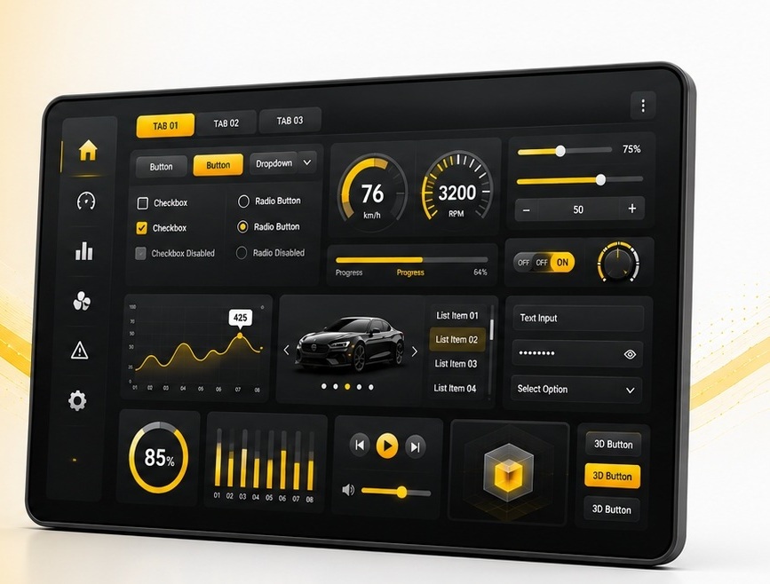
36+ Widgets — Four Categories
Browse Sparklet's widget library by category. All widgets are configurable via Flint UI Designer without writing initialisation code.
Layout & Container Widgets — Organise Your Interface
These widgets provide the foundational structure for organising your user interface. They act as parents and containers, controlling how child widgets are positioned, layered, and scrolled.
FixedView Widget
The essential container for managing multiple child widgets. Position and layer elements with pixel-perfect control, creating static layouts, headers, or footers. All child coordinates are relative to the FixedView origin, making it simple to build composite screen panels.
CarouselView Widget
Create engaging, swipeable showcases for products, features, or images. Supports both horizontal and vertical orientations with fluid animations to capture user attention. Commonly used in consumer appliances and home automation panels for feature category browsing.
ScrollView Widget
Enable scrolling for content that exceeds the screen size. ScrollView is a fundamental container that houses a single child widget and provides smooth vertical or horizontal scrolling. Contains three internal sub-widgets: two ScrollBars and a Viewport. Supports both touch-drag and programmatic scroll.
ListView Widget
Display items sequentially, either vertically or horizontally. Perfect for menus, contact lists, or settings pages. Comes with built-in styles for solid colour, transparent, or image-based backgrounds. Supports item selection events and programmatic scrolling to a specific item index.
GridView, Holder, Viewport, Window, Dialog, MsgBox
Additional container and shell widgets: GridView for uniform tile layouts; Holder for framework-internal widget grouping; Viewport for clipped sub-canvas regions; Window as the top-level screen container; Dialog for modal pop-up interactions; MsgBox for brief non-blocking notifications.
User Input & Control Widgets — Drive Interactions
Interactive elements that allow users to control the application. All input widgets support configurable visual states (idle, pressed, focused, disabled) and fire typed events that the application handles via state machine or direct callback.
Push Button
The classic action-oriented button designed to trigger a specific, immediate function when pressed or clicked. Ideal for Start, Stop, Save, Confirm, or screen-navigation actions. Fully customisable appearance with text, icon, and distinct visual feedback states for each interaction phase.
Radio Button
Used when a user must select only one option from a mutually exclusive set. When a radio button in a group is selected, the previously selected button is automatically deselected. Essential for settings pages, configuration menus, and mode selection (language, measurement unit, operational mode).
Toggle Button
A stateful control that switches between two distinct states (On/Off, Active/Inactive) with each press. Unlike a push button, a toggle button retains its state until pressed again. Perfect for enabling or disabling features such as Wi-Fi, Bluetooth, Mute, or light/dark mode. Unique visuals configurable per state.
Slider Widget
Allows users to select a value from a continuous range by dragging a handle along a track. Ideal for adjusting settings like volume, brightness, or temperature. Supports horizontal and vertical orientations. Fires four event sub-types: DRAG_START, DRAG, DRAG_END, and VALUE_CHANGE for fine application integration.
Rotary Knob, Edit Box, On-Screen Keyboard, CheckBox, SwipeButton, StepInput
Rotary Knob: skeuomorphic control mimicking physical dials — ideal for audio equalisers and thermostat interfaces. Edit Box: text input with integrated OSK support. On-Screen Keyboard: customisable QWERTY or numeric keyboard, available as default templates. CheckBox: boolean toggle with label. SwipeButton: confirm-by-swipe action. StepInput: increment/decrement control for bounded integer values.
Display & Data Visualisation Widgets — Show Information Clearly
Widgets designed to present information to the user — from static labels and images through real-time graphs and animated clock faces. All display widgets support dirty-region invalidation so that only changed pixels are redrawn each frame.
Graph Widget
A powerful tool for visualising data. Renders real-time or historical data as Line Charts, Bar Graphs, or Range Graphs. Highly customisable axes, labels, and data series make it suitable for medical monitors (ECG traces, vitals history), industrial dashboards (temperature trending, process variables), and fitness trackers.
Meter (Dial / Gauge)
A classic circular control for displaying a value within a range — speedometers, tachometers, pressure gauges, and battery level indicators. Customise needle style, tick marks, colour zones, and graduation labels. Commonly used in automotive instrument clusters and industrial HMI panels. Hardware-accelerated arc rendering on D/AVE2D and DMA2D platforms.
ProgressBar Widget
Indicates the status of a task or value relative to a defined range. Supports Linear (horizontal/vertical) and Circular variants. Animated value transitions interpolate smoothly from current to target over a configurable duration. Used for file downloads, installation progress, dose delivery (medical), and battery charge level (consumer).
Labels (Static / TextArea)
Display static or dynamic alphanumeric text with advanced overflow handling: Clip, Ellipsis, and Marquee (auto-scrolling text). Supports text rotation for vertical label orientations. TextArea renders multi-line HTML-like content with font size and colour mixing. Both widgets support Unicode including pre-shaped Arabic RTL text from Flint.
ImageHolder, Clock, BusyIndicator, DotNavigator
ImageHolder: displays static or dynamic PNG/JPG/BMP images with transparency support. Clock: fully customisable analogue clock with configurable hands, dial face, and tick marks — supports both real-time and application-driven time values. BusyIndicator: animated spinner for background task feedback. DotNavigator: pagination indicator dots for carousel and multi-screen navigation.
Navigation & Selection Widgets — Guide Users Through Screens
Widgets for navigating between screens, selecting items from lists, and organising content into tabs. These widgets work closely with the Sparklet state machine layer to implement multi-screen navigation flows without manual screen-switch code.
Tab Widget
A container that presents multiple content panes with a tab header row. Selecting a tab switches the visible pane without a full screen transition. Used for settings pages with multiple categories, product information panels, and instrument cluster multi-view dashboards.
ListBox
A scrollable list of selectable text or image items. ListBox fires a SELECTION_CHANGE event when the user selects an item. Supports single-selection mode. Used in configuration screens, file browsers, and menu-driven navigation flows.
ComboBox
A collapsed selection control that expands into a drop-down item list on activation. Space-efficient alternative to a full ListBox for small display areas. Supports both touch-tap and rotary-encoder input for selection confirmation.
Menu
A hierarchical menu widget supporting multi-level navigation trees. Items can be nested to any depth; selecting a parent item expands its child list. Menu integrates directly with the Sparklet state machine for automatic screen-transition events on item selection.
TaskBar, WheelPicker, 3DWidget, 3DView, Keyboard
TaskBar: persistent application launcher or status bar with icon slots. WheelPicker: scrolling drum/picker control (time, date, numeric value selection) with inertia animation and snap-to-value. 3DWidget: renders an imported .obj or .fbx 3D model inline in a 2D screen. 3DView: full OpenGL ES 3D scene container on MPU targets. Keyboard: configurable on-screen keyboard host widget.