
In the world of embedded GUI development, efficiency is everything. While high-resolution images and complex assets have their place, the backbone of a highly performant user interface often relies on fundamental geometry.
Enter the Fill Shape Layer in the Sparklet UI Designer. This powerful feature allows developers and designers to generate essential graphic primitives directly within the Sparklet framework, bypassing the need for memory-heavy bitmap assets. In this guide, we will explore the supported shapes, their configuration parameters, and how to leverage them to build sleek, responsive embedded interfaces.
What is the Fill Shape Layer?
The Fill Shape Layer is a fundamental widget in Sparklet that renders vector-based geometric shapes filled with a solid color. Unlike imported images, these shapes are drawn dynamically by the Sparklet engine at runtime.
Why does this matter?
- Memory Optimization: Shapes consume a fraction of the memory required for raster images.
- Scalability: They remain crisp at any resolution without pixelation.
- Dynamic Styling: You can change properties (like color or position) programmatically in real-time.
Supported Shapes and Parameters
Sparklet supports a versatile suite of geometric primitives. Let’s break down each shape, how to configure it, and where to use it in your next project.
Rectangle:
The workhorse of UI design. The rectangle is the default shape for backgrounds, containers, and interactive areas.
Parameters:
X / Y: The coordinate of the top-left corner.
Width / Height: The dimensions of the box.
Color: The hex code or defined color variable for the fill.
Real-World Use Cases:
Card Backgrounds: Grouping related data (e.g., a sensor reading panel).
Progress Bar Tracks: The static background behind a dynamic loading bar.
Pop-up Modals: Creating a distinct overlay for user alerts.Circle:
Perfectly symmetrical and widely used for focus points.
Parameters:
Center X / Center Y: The precise center point of the circle.
Radius: The distance from the center to the edge.
Color: Color: The fill color.
Real-World Use Cases:
Status Indicators: Green/Red dots indicating system connectivity.
Notification Badges: Small circles overlaying icons to show unread messages.
Touch Points: Visual feedback markers for touchscreens.Arc:
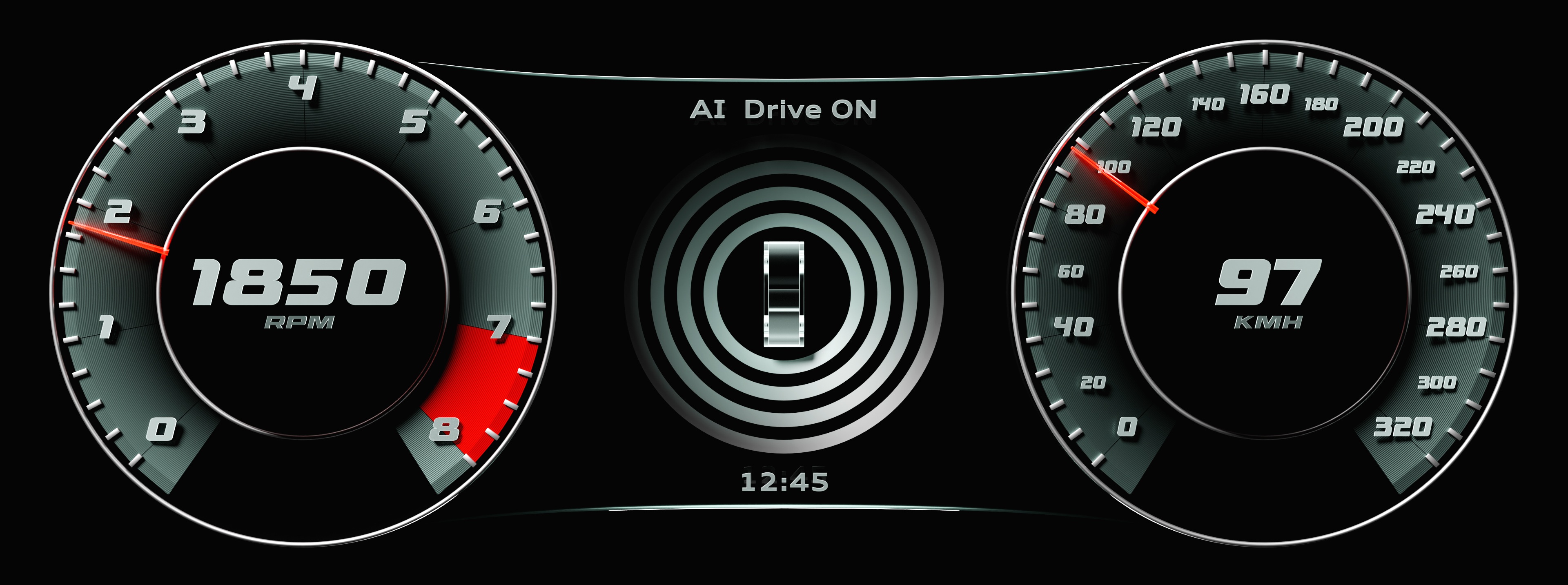
The Arc is a segment of a circle, essential for modern, automotive-style interfaces.
Parameters:
Center X / Center Y: The pivot point of the arc.
Radius: The size of the arc.
Start Angle / End Angle: Defines the span of the arc in degrees.
Color: Color: The fill color.
Real-World Use Cases:
Digital Gauges: Speedometers or tachometers where the fill represents the current value.
Thermostats: Circular sliders for temperature control.
Loaders: Animated "spinner" rings.Triangle:
A polygon with three edges and three vertices.
Parameters:
Vertex 1 (X,Y), Vertex 2 (X,Y), Vertex 3 (X,Y): The absolute coordinates for each corner.
Color: Color: The fill color.
Real-World Use Cases:
Directional Arrows: Navigation pointers in mapping applications.
Media Controls: The universal "Play" symbol.
Warning Signs: Yellow triangular backgrounds for alert icons.Quadrilateral:
Unlike the standard rectangle, the quadrilateral allows for four irregular points. This is powerful for creating non-rectilinear layouts.
Parameters:
Vertices (x4): Coordinates for all four corners, allowing for independent positioning.
Color: Color: The fill color.
Real-World Use Cases:
Perspective Effects: Simulating depth by narrowing one side of a panel.
Custom Keyboards: Creating slanted keys for ergonomic or stylized layouts.
Masking Areas: Defining complex touch zones that aren't perfectly square.Ellipse:
A "squashed" circle, defined by two different radii.
Parameters:
Center X / Center Y: The central point.
Radius X: The horizontal width from center.
Radius Y: The vertical height from center.
Color: Color: The fill color.
Real-World Use Cases:
Shadows: Flattened dark ellipses under objects to create a 3D hovering effect.
Perspective Buttons: Circular buttons viewed from an angle.
Highlights: Glossy reflections on curved surfaces.
Technical Benefits for Embedded Engineers
Using the Fill Shape Layer isn't just an aesthetic choice; it is an engineering decision.
- Reduced Flash Usage: A 200x200 pixel PNG image might take up 80KB (uncompressed). A 200x200 Rectangle in Sparklet takes up only a few bytes of code instructions.
- Faster Rendering: The Flint engine can render primitive shapes significantly faster than decoding and blitting bitmaps, leading to higher frame rates on resource-constrained MCUs.
- Theming Capability: Because the Color parameter is a variable property, you can easily implement "Dark Mode" or user-defined themes without storing duplicate image assets.
Conclusion
The Fill Shape Layer in Sparklet is more than a drawing tool—it is a cornerstone of optimized embedded GUI design. By understanding how to manipulate Rectangles, Arcs, and Polygons using their specific parameters, you can build interfaces that are not only visually striking but also incredibly lightweight and responsive.
Ready to start designing? Open Sparklet today and try replacing your static background images with dynamic Fill Shape Layers.
https://sparkletui.com/documentation/