
Text is one of the most frequently used elements in any user interface. Whether it is a system message, menu label, status indicator, or measurement value, text provides the primary channel through which users understand what a system is doing. In embedded systems, however, displaying text correctly is not always straightforward. Unlike desktop or mobile interfaces, embedded displays operate under strict constraints such as limited screen space, fixed layouts, and small display resolutions.
One of the most common challenges designers encounter is text overflow—when the content exceeds the available display area of a label or text widget. If not handled properly, overflowing text can break layouts, hide critical information, or create confusing interfaces. Sparklet UI Designer addresses this problem with flexible text overflow handling options, allowing designers to control exactly how long text behaves inside a UI element.
In this article, we explore how text overflow in Sparklet UI Designer works and how designers can use strategies such as clip, marquee, and ellipsis to build clear and readable embedded interfaces.
Why Text Overflow Matters in Embedded UI
In embedded devices, space is always limited. Consider a few common scenarios:
- An automotive dashboard displaying warning messages
- An industrial HMI showing machine status updates
- A smart appliance displaying operational modes
- A medical device presenting diagnostic results
In these cases, text length may vary depending on system conditions, language translation, or dynamic data values. If the UI does not handle long text properly, the result can be truncated messages or broken layouts.
For example, a short status message like “Ready” may later change to “System initialization in progress”. Without proper overflow management, the message may extend beyond the label boundary and overlap with other UI elements.
To address this challenge, Sparklet provides multiple text overflow handling strategies that ensure the interface remains clean and readable regardless of text length.
Understanding Text Overflow in Sparklet UI Designer
In Sparklet UI Designer, the Text Layer (Label widget) includes built-in options that define how the system should behave when text exceeds the defined label width. Instead of forcing designers to manually resize or reposition widgets, Sparklet allows them to select a specific overflow strategy that matches the UI requirement.
The primary text overflow modes supported include: Clip, Marquee, Ellipsis (End), Ellipsis (Start)
Each option provides a different way of handling long text, giving designers flexibility to maintain both layout consistency and usability.
Clip Overflow: Strict Layout Control
The Clip option simply cuts off any text that extends beyond the label boundary. The text is rendered only within the defined area, and any extra characters are not displayed.
This approach is useful in situations where maintaining the layout structure is more important than displaying the full text content. For example, dashboards or control panels often use fixed-size status fields where consistent alignment is required across multiple widgets.
Clip overflow is typically used for: Numeric readings, Short status indicators, Fixed-length labels, Compact UI layouts.
While clipping ensures visual consistency, it should be used carefully because important information might be hidden if the text is longer than expected.
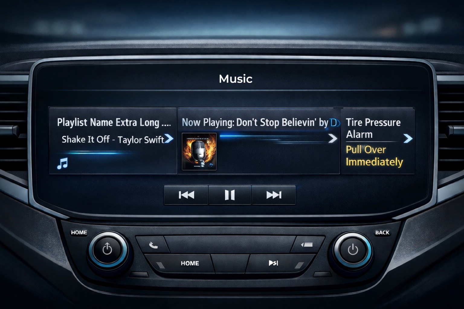
Marquee Overflow: Scrolling Text for Full Visibility
Another powerful option in Sparklet is the Marquee overflow mode. Instead of hiding or truncating text, marquee enables horizontal scrolling when the text exceeds the label width.
This approach ensures that the entire message remains visible to the user, even when screen space is limited.
Marquee text is commonly used in embedded systems such as: Automotive infotainment systems, Notification bars, Industrial alarm messages, IoT device status displays.
For example, an alert message like “Engine temperature exceeding safe operating range” may not fit within a small label. With marquee overflow, the text scrolls smoothly across the display, ensuring the user can read the complete message without disrupting the UI layout.
Marquee is particularly useful for dynamic system messages and alerts, where the content length cannot always be predicted.
Ellipsis Overflow: Indicating Truncated Content
The Ellipsis overflow option is widely used in user interface design because it provides a clear visual cue that text has been truncated. Sparklet supports two ellipsis modes:
- Ellipsis End In this mode, the text is shortened and replaced with three dots (…) at the end. For example: “System configuration updat…” This approach allows users to quickly recognize that additional text exists beyond what is currently visible.
- Ellipsis Start Ellipsis can also appear at the beginning of the text, showing the most relevant part at the end of the label. For example: “…configuration updated successfully”. This option is useful when the ending portion of a message contains the most important information, such as file names or measurement values.
Ellipsis overflow is ideal for: Menu labels, File names, Data entries, Information lists. Because it maintains a clean layout while still indicating truncated content.
Choosing the Right Overflow Strategy
Selecting the appropriate overflow behavior depends on the type of information being displayed and the context of the interface.
Some general guidelines include:
- Use Clip for fixed-length values where layout consistency is critical.
- Use Marquee for alerts or notifications that must be fully readable.
- Use Ellipsis End for menu labels or descriptive text.
- Use Ellipsis Start when the end of the message carries the key information.
By carefully choosing the right overflow strategy, designers can ensure that long text never disrupts the user interface while still communicating important information effectively.
Benefits of Text Overflow Handling in Sparklet
The text overflow feature in Sparklet UI Designer provides several advantages for embedded UI development.
First, it helps maintain consistent layouts across different screen sizes and resolutions. Designers can define label dimensions without worrying about unpredictable text behavior.
Second, it improves usability and readability, especially when dealing with dynamic system messages or multilingual content.
Third, it reduces the need for manual layout adjustments, allowing developers to focus more on UI logic and functionality.
Finally, it enables scalable interface design, ensuring that UI components behave reliably across different devices and display configurations.
Conclusion
Handling long text effectively is essential for building clear and reliable embedded interfaces. Without proper overflow management, even a well-designed UI can become cluttered or confusing when text exceeds the available space.
Sparklet UI Designer simplifies this challenge by providing flexible text overflow strategies, including clip, marquee, and ellipsis options. These features allow designers to control exactly how text behaves within UI elements while preserving layout integrity and user readability.
Whether you are designing automotive dashboards, industrial HMIs, or consumer embedded devices, understanding how to manage text overflow is an important step toward building professional and user-friendly interfaces. By leveraging Sparklet’s built-in overflow handling capabilities, developers can ensure their embedded UI remains both functional and visually consistent—even when text length varies.
https://sparkletui.com/documentation/