
Designing embedded graphical interfaces is challenging — especially when your UI needs to switch screens, respond to logic, and feel fluid on devices with limited resources. In traditional code-based approaches, managing screen transitions often means writing complex logic that tightly couples UI and application events. Sparklet changes all that with a visual, drag-and-drop, model-based interface that abstracts UI behavior into designer-friendly components. One such critical component is the Placeholder.
In this blog, we’ll explain what a Placeholder is in Sparklet UI Designer, why it matters for embedded UIs, how it works within the Sparklet project structure and real-world use cases. By the end, you’ll understand how placeholders help you build flexible, dynamic, and maintainable UI flows without writing a single line of code.
What is a Placeholder in Sparklet UI Designer?
A Placeholder is a special UI component in Sparklet that acts as a container for multiple views. Essentially, it occupies a fixed area within a screen or window and dynamically displays different views based on UI logic or events.
Think of a placeholder as a view switcher — you define one container, and then you can load or switch multiple screens (views) into it depending on user interaction or state machine logic. This is crucial in embedded systems where memory and processing power are limited, and redundant screens must be avoided.
In traditional applications, switching screens might require complex condition checks and manual hide/show control of widgets. In Sparklet UI Designer, placeholders paired with a Hierarchical State Machine (HSM) automate this workflow elegantly.
Primary Use Case: Dynamic Screen Transitions
One of the most common needs in embedded UI design is screen navigation. For example, an automotive instrument cluster might have: a splash screen on startup, a main dashboard view, and a settings view. Rather than creating separate windows for each and manually handling transitions, a placeholder lets you register all relevant views and then let the state machine show or hide them within the placeholder based on triggers or events.
This pattern improves modularity and reuse: you define your views once, then simply swap them as needed using a state machine without duplicating code.
How Placeholder Works with State Machines
Standalone placeholders are useful, but when combined with Hierarchical State Machines (HSM) they become powerful building blocks for dynamic logic.
State machines define states — such as init, main_screen, settings_screen, etc. — and actions to perform when entering or exiting these states. A placeholder makes it easy to show or hide the correct view for each state without low-level logic. For example:
- On startup, the placeholder loads a splash view
- After a delay, the state machine switches to main_screen
- A button press event triggers a transition to settings_screen
Within your state machine definition, you include actions like Place holder → Show View or Place holder → Hide View, referencing the placeholder ID you created earlier.
In essence, the placeholder internalizes the choice of view — leaving you to focus on state logic instead of manually manipulating widgets. This separation of concerns improves maintainability and readability in complex UI projects.
Advantages of Using Placeholders in Embedded UI
- Modular UI Architecture: Placeholders promote a modular design. Instead of coupling views together with cross-dependencies, you simply register them within a placeholder and let the state machine decide. This reduces tight coupling and encourages reuse.
- Clean and Maintainable Transitions: With placeholders, transitions between screens are driven by high-level state definitions rather than imperative code. This makes transitions predictable and easier to debug.
- Better Performance on Resource-Constrained Platforms: By reusing a single placeholder container, you minimize memory overhead compared to allocating multiple windows or screens for every navigation path. This fits perfectly with embedded hardware constraints.
Real-World Use Cases
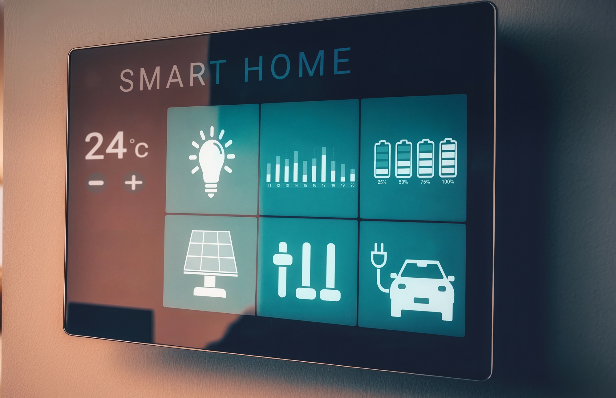
- Automotive Instrument Panels: Consider a vehicle dashboard: a splash screen on ignition, main speedometer view, and a settings menu. Using a placeholder means all these screens can be managed within one container tied to the instrument cluster’s main window. Logic is driven by events such as ignition status or button presses.
- Industrial Control Panels: Control panels often have multiple control menus and status pages. A placeholder lets you switch between these sections without disrupting the primary UI shell. A state machine can drive flows like error handling screens, idle screens, or active control screens.
- Consumer Electronics: Smart appliances — like smart thermostats or IoT devices — often require smooth navigation between menus, settings, alerts, and feedback screens. Placeholders help manage these transitions with clarity and less code.
Placeholder: Not Just a Static Container
In traditional web or application design, a placeholder often refers to a temporary space filler or hint. But in the context of Sparklet, its role is much more powerful — it actively manages which view should be current, acting as an environment for dynamic UI control. While other UI frameworks use placeholders to indicate loading areas or unfilled space, Sparklet placeholders serve as foundational building blocks for UI navigation logic.
Conclusion
Placeholders in Sparklet are more than just holders for views — they are the backbone of dynamic screen management in embedded UI design. By acting as containers for multiple views and working hand-in-hand with hierarchical state machines, placeholders let you build clean, efficient, and maintainable user interfaces for embedded systems without complex code.
Whether you’re designing automotive dashboards, industrial HMIs, or consumer IoT screens, placeholders make your UI flow logic simpler and more intuitive, saving you development time and reducing bugs.
https://sparkletui.com/documentation/