
As embedded systems grow more capable and feature-rich, their user interfaces must evolve accordingly. Users expect intuitive, smartphone-like experiences even on embedded devices with limited resources. One such interface element that brings clarity and elegance to multi-view navigation is the Dot Navigator. Often seen as a row of small circular indicators, dot navigators are an effective way to guide users across different views, screens, or content pages.
In this article, we delve into the design role of dot navigators, explore their diverse use cases, and showcase how the Sparklet DotNavigator Widget brings this elegant interaction model to embedded platforms. With deep customizability, theme flexibility, and resource efficiency, Sparklet empowers developers to deliver responsive and intuitive multi-view experiences.
The Role of Dot Navigators in Embedded UI Design
A Dot Navigator is a visual representation of multiple active views or pages, typically displayed as a horizontal or vertical series of small dots. One dot is marked as active (selected), and the others represent alternate views that can be selected. Dot navigators serve several key functions:
- Visual Positioning: Indicate the current page or section within a carousel or tabbed interface.
- View Switching: Allow users to directly tap/click to move to another view.
- Gesture Feedback: Complement swipe-based navigation by showing where the user is in a sequence.
Because of their simplicity and universality, dot navigators are ideal for embedded systems with limited screen real estate. They offer a clean and modern UI pattern that enhances navigation without cluttering the interface.
Real-World Use Cases of Dot Navigators
Dot navigators are used across a variety of applications, making them a versatile UI widget:
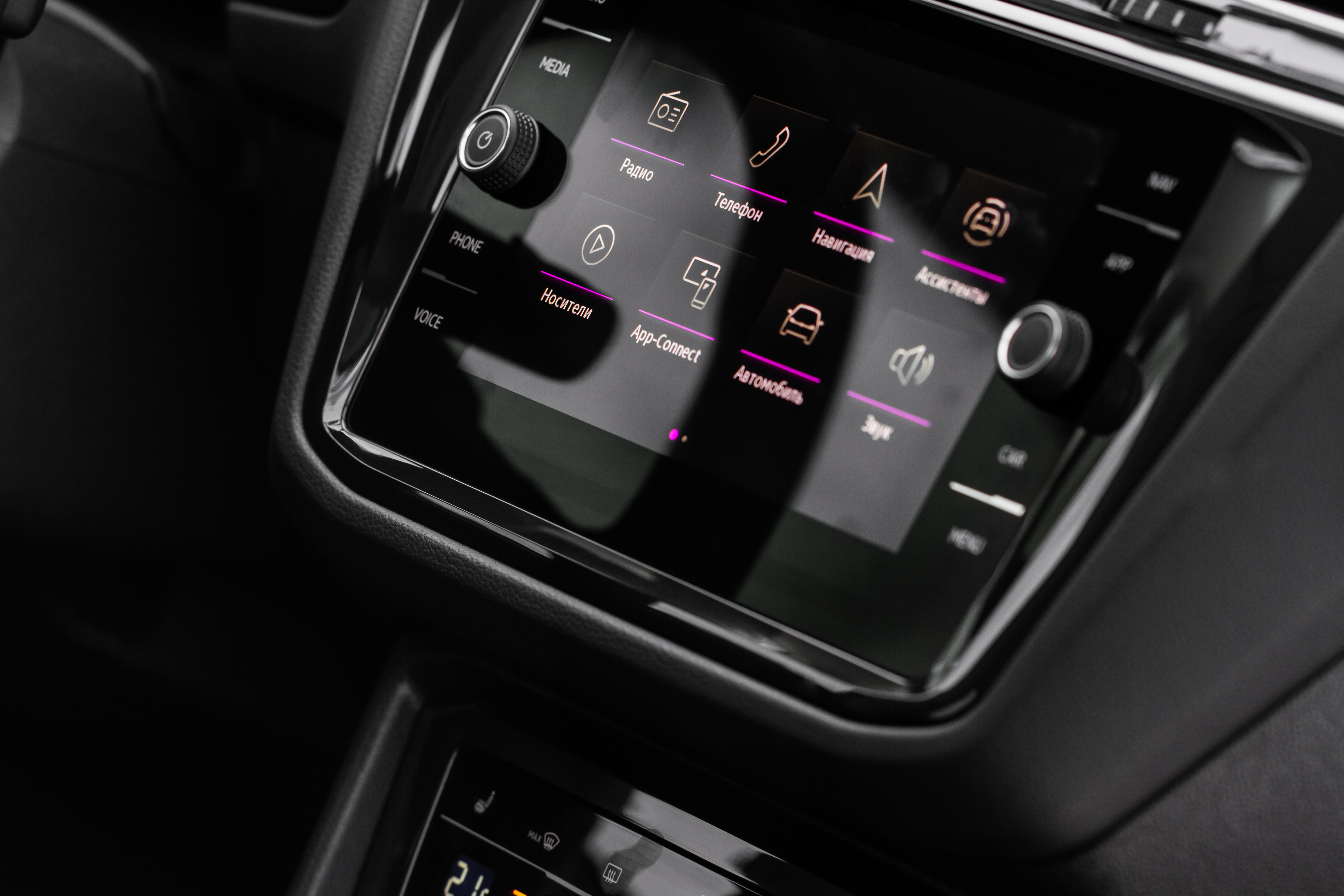
- Infotainment Systems (Automotive): In automotive infotainment systems, they are often used to switch between music, navigation, and climate control screens or to indicate the current tab in horizontally scrollable menus.
- Medical Devices: Medical devices employ them to move between vital statistics displays, historical charts, or to structure multi-step diagnostic procedures in an intuitive way.
- Smart Home Panels: Smart home panels also benefit from dot navigators, allowing users to toggle between different rooms, device controls, or dashboard views.
- Wearables and Fitness Devices: On wearables and fitness devices, they enable smooth cycling through daily statistics such as steps, heart rate, and calories, while also providing subtle feedback for swipe gestures on small round screens.
- Consumer Electronics: In consumer electronics, dot navigators are commonly used to slide between photo albums, settings menus, or onboarding screens in wizard-style interfaces.
Across all these scenarios, dot navigators enhance usability by enabling seamless navigation through multi-screen interfaces without relying on text-heavy menus or oversized control elements.
Introducing the Sparklet DotNavigator Widget
The Sparklet DotNavigator Widget brings the power of dot-based navigation to embedded systems. It’s optimized for high responsiveness, visual elegance, and compact memory usage—making it ideal for MCUs, RTOS, and embedded Linux platforms.
Highly Customizable Dot Appearance
With Sparklet, developers can tailor the look and feel of dot navigators to match their application branding:
- Unselected/Selected Dots: Choose different images, colors, or vector assets for each state.
- Spacing and Layout: Define horizontal/vertical layout, spacing between dots, alignment (left/center/right).
- Dot Shape and Size: Use circular, square, or custom SVG shapes for unique styles.
This flexibility allows seamless integration with diverse design themes—from minimalistic to industrial.
Dynamic Theme Support
Modern UI designs demand support for light and dark modes, color themes, and state-specific visuals. Sparklet makes this easy:
- Automatically switch dot visuals based on the active UI theme.
- Overlay effects or shadows to enhance visibility in different lighting conditions.
- Match colors to application alerts (e.g., red theme for alarms, green for success states).
Themes can be toggled at runtime, ensuring a cohesive look across different modes and user preferences.
Efficient Navigation Interaction
Dot navigators are not just passive indicators—they're interactive elements. Sparklet enables:
- Touch/Click Selection: Users can directly tap a dot to switch views.
- Swipe Integration: Automatically syncs with swipe gestures for horizontal/vertical navigation.
- Auto-Update: Dynamically update the active dot based on page changes.
This ensures smooth transitions between views, reducing the cognitive load on the user.
Resource-Conscious Implementation
Embedded systems often lack the luxury of excess memory or GPU horsepower. Sparklet DotNavigator Widget is built to thrive in constrained environments:
- Low Memory Footprint: Typical RAM usage is under 25 KB with assets.
- Optimized Rendering: Partial screen refresh support ensures only the dot area is redrawn.
- No GPU Required: Efficient CPU-based drawing engine.
Whether running on Cortex-M MCUs or ARM-based embedded Linux platforms, Sparklet ensures a lag-free user experience.
Easy Business Logic Integration
A great widget must also integrate cleanly with the underlying logic. Sparklet delivers this through a simple, developer-friendly configuration interface:
- Mapping Configuration: Assign callbacks or state changes to dot selection events.
- Page Syncing: Automatically tie the widget to a view controller or screen manager.
- OS Agnostic: Works across bare-metal, RTOS, and embedded Linux environments.
This minimizes the time needed to wire up UI controls to application logic—accelerating your development cycle.
Developer Tools and Ecosystem Support
Sparklet is not just about individual widgets—it’s a complete embedded graphics ecosystem. Developers benefit from:
- Widget Preview Tool: Visualize and test DotNavigator behavior during development.
- Integrated Documentation: Comprehensive API references, design guides, and code examples.
- Ready-to-Use Templates: Prebuilt dot navigator layouts for common UI patterns.
- Modular Integration: Seamlessly combine with Sparklet’s Slider, Panel, or SwipeButton widgets.
These features dramatically cut down development time and reduce integration risk.
Why Choose Sparklet for Embedded UI Development
Developing a modern UI on embedded hardware shouldn’t mean compromising on quality, performance, or usability. Sparklet bridges the gap with a suite of GUI widgets purpose-built for embedded environments. The DotNavigator Widget is a shining example—simple to use, elegant in design, and powerful in execution. With Sparklet, embedded UI developers can:
- Achieve pixel-perfect designs even on low-end MCUs.
- Rapidly prototype and deploy production-ready UIs.
- Create scalable interfaces that grow with device complexity.
From consumer devices to industrial controllers, Sparklet empowers you to bring world-class UI experiences to the embedded world.
Final Thoughts and Call to Action
Dot navigators may seem like a small component, but they play a big role in modern user interfaces. The Sparklet DotNavigator Widget provides an ideal solution for developers seeking responsive, visually appealing multi-view navigation on embedded systems. Whether you're designing an automotive display, a smart appliance, or a fitness wearable, Sparklet delivers the tools you need to implement intuitive screen transitions with minimal overhead.
Start building smarter interfaces today. Visit the Sparklet Widget documentation to explore integration options, configuration guides, and design best practices.