
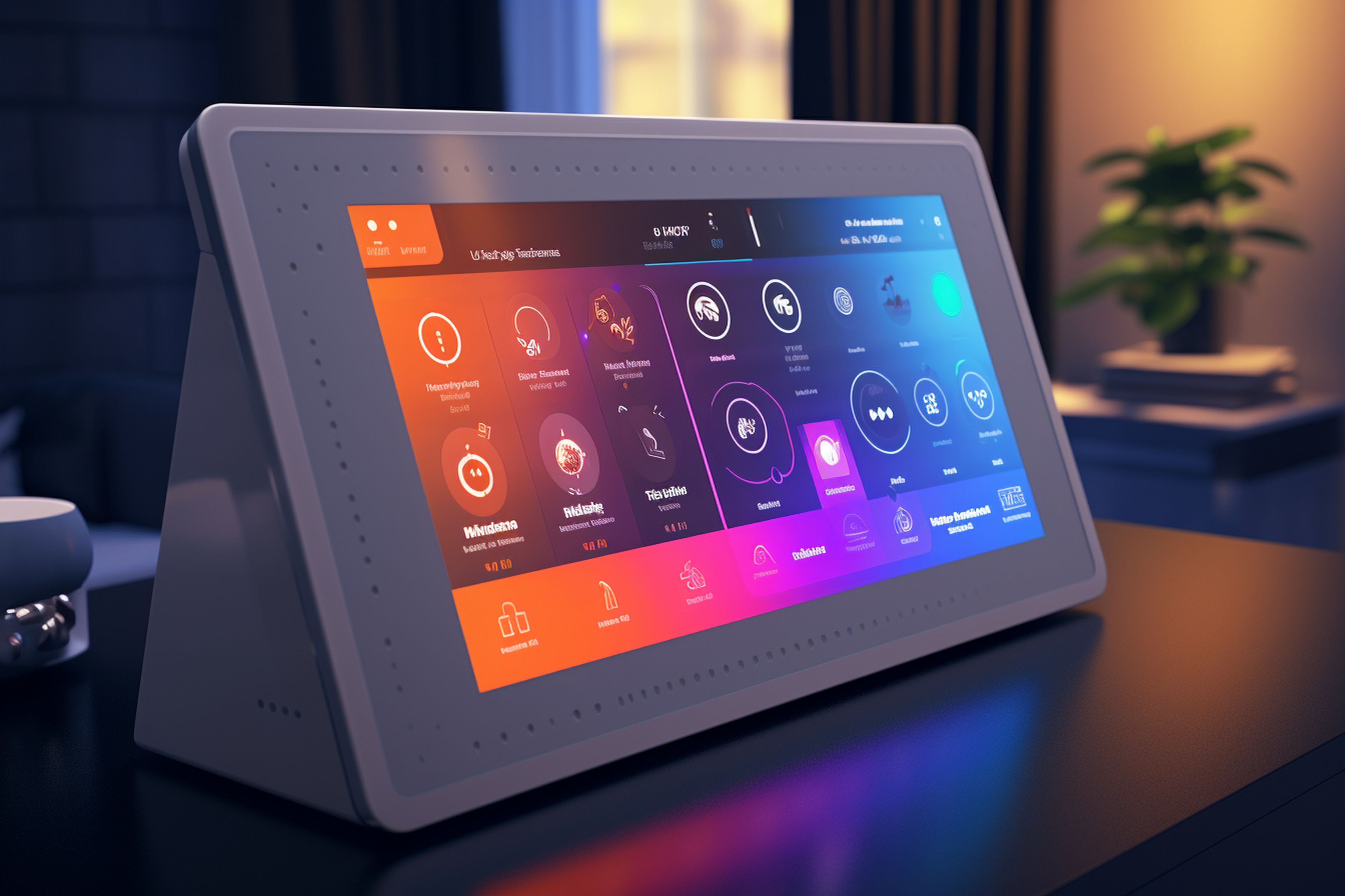
In modern embedded GUI design, users expect seamless adaptability between themes, whether shifting from light to dark modes or adjusting color palettes for different contexts. These fluid theme transitions not only enhance aesthetics but also create a more intuitive and engaging experience. With Sparklet, developers can implement smooth, resource-efficient UI animations that bring theme changes to life, ensuring consistency, responsiveness, and a premium feel across devices.
Every element in an interface is an opportunity to enhance user experience. A button, for example, isn’t just static—it can evolve as the interface shifts between themes. The fluid theme transitions powered by UI State Animations in Sparklet UI Designer make these changes feel natural and tactile.
In this blog, we’ll dive into this powerful capability, showing how it moves beyond simple on/off logic to deliver rich, context-aware animations that define modern embedded GUI design—all while staying efficient on resource-constrained hardware.
Beyond Binary: The Power of Custom UI States
First, let's clarify what we mean by a "UI State." While some widgets have built-in internal states (like a checkbox being checked or unchecked), the UI State feature in Sparklet is about creating your own custom, self-defined states for any widget. You are no longer limited to the default appearances. You can define states like ‘active’, ‘inactive’, ‘error’, ‘connecting’, or ‘highlighted’—whatever your application requires.
A UI State Animation, therefore, is the transition effect that occurs when a widget moves from one of these custom states to another. Instead of a property like color or size snapping instantly to a new value, Sparklet's engine smoothly interpolates between the old and new states over a defined duration.
This capability is the key to providing clear, immediate, and elegant feedback. It’s the visual language that tells your user: "I understand your input," "Attention is needed here," or "The system status has changed."
Practical Use Cases: Breathing Life into Your Components
The applications for UI State Animations are virtually limitless, allowing you to add a layer of polish and clarity to every interaction. Here are a few powerful examples of how this feature can be used within our Sparklet UI Designer.
- Seamless and Elegant Theme Changes: This is a standout feature for modern applications. Many devices now offer light and dark modes. A jarring, instantaneous switch between themes can be visually disruptive. With Sparklet, you can define UI states for ‘light_mode’ and ‘dark_mode’ on your primary UI elements. When the user toggles the theme, instead of an abrupt change, our animation engine can smoothly transition the properties. Backgrounds can gracefully animate from white to dark grey, text can transition from black to off-white, and icon colors can cross-fade beautifully. This single use case can dramatically elevate the perceived quality and polish of your entire application.
- Dynamic and Tactile Button Feedback This is the quintessential example. A standard button can have several UI states: Normal: The default appearance. Pressed: When the user is touching it. Disabled: When the action is unavailable. Instead of just swapping images, you can animate the transitions. When a user presses the button, you can trigger a transition to the ‘pressed’ state. This animation could involve the button slightly shrinking (Scale) and its background color subtly darkening (Color). The result? A button that feels satisfyingly tactile and responsive, as if it has real physical properties. When it becomes disabled, it can smoothly fade to 50% opacity (Alpha), clearly communicating its inactive status.
- Intelligent Input Field Validation Imagine a user filling out a form on a medical device or industrial controller where data accuracy is critical. With UI State Animations, you can provide instant validation feedback. If the user enters an invalid value, you can programmatically switch the input field’s UI state to ‘error’. The animation tied to this state change could make a red border fade into view around the field and perhaps execute a quick, subtle side-to-side shake (Position). This feedback is immediate, unambiguous, and far more intuitive than showing a separate error message after the user has moved on.
- Clear Connectivity and Status Indicators Consider a Wi-Fi or Bluetooth icon on your device. It can have several states: ‘disconnected’, ‘connecting’, and ‘connected’. Using UI State Animations, you can make these states clear and intuitive. The transition to the ‘connecting’ state could trigger a pulsing animation (animating the Alpha property up and down). When a connection is established, it can transition to the ‘connected’ state by smoothly animating to a solid, bright color (e.g., blue). If the connection is lost, it can fade to a semi-transparent gray. This animated feedback provides at-a-glance information that is much clearer than static icons.
Effortless Customization for a Unique Brand Feel
One of the core principles behind Sparklet is to empower developers and designers without forcing them to write complex animation code. All UI State Animations are configured visually within our Sparklet UI Designer.
The process is simple:
- Define Your States: For any widget, you create and name your custom UI states (e.g., ‘normal’, ‘error’).
- Style Each State: For each state you define, you set the desired visual properties (e.g., for the ‘error’ state, you set the border color to red).
- Define the Animation: You then define the animation for the transition into that state. You can control the duration, add a delay, and select an easing curve. You can animate multiple properties at once, such as Color, Alpha, Position (X/Y), and Scale (X/Y), to create a compound effect.
This declarative approach means you can rapidly prototype and refine your micro-interactions. The ability to finely tune the timing and properties of each transition allows you to craft a motion language that is perfectly aligned with your product's brand identity.
Optimized Performance on Real-World Embedded Hardware
All this talk of animation might raise a valid concern for embedded developers: performance. We architected the Sparklet Animations & Transitions engine from the ground up for efficiency. Our C-based rendering engine minimizes CPU overhead and has a remarkably low memory footprint.
State transitions are calculated on the fly with minimal computational cost. Whether it's a single button animating or dozens of widgets transitioning during a theme change, the engine is designed to maintain a smooth frame rate without compromising the responsiveness of your core application. This means you can confidently deploy a rich, modern, and animated UI on your target MCU or MPU without fear of performance bottlenecks.
Conclusion
The difference between a good UI and a great UI often lies in the details. UI State Animations are the tool that allows you to perfect those details. They transform static components into responsive, communicative elements that provide constant, helpful feedback to the user. This creates a sense of trust, reduces cognitive load, and makes your product an absolute pleasure to use.
With Sparklet, this advanced functionality is no longer out of reach for embedded systems. We provide a powerful, performant, and intuitive toolset that enables you to build the kind of sophisticated, animated interfaces that will make your product stand out. Ready to bring your widgets to life with dynamic state transitions? We encourage you to explore our documentation and see for yourself how you can start implementing UI State Animations in your next project.
https://sparkletui.com/flint-ui-designer