Circular ProgressBar widget

Here are the steps to utilize the Circular Progress Bar widget:

  • Place the Circular ProgressBar widget onto the design view and adjust its dimensions as required.

  • Customize the default layers (Background and Foreground image layer) by adding images.

Circular ProgressBar Widget :width: 100%

Circular ProgressBar Widget

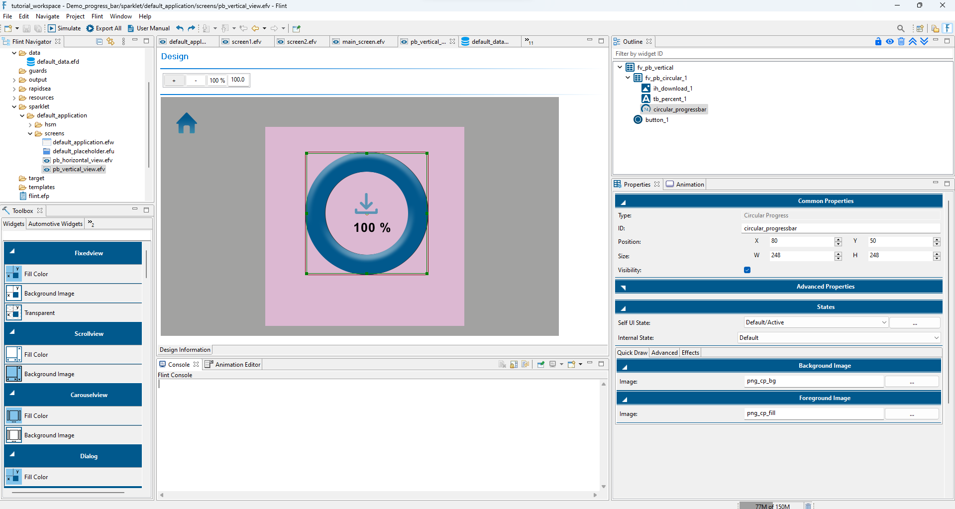
  • In the Advanced Properties section, configure the widget by setting the Direction as Clockwise, mapping the Data variable to “Cur Val,” and defining the Minimum and Maximum range.

Advanced Properties settings :width: 100%

Advanced Properties settings

  • Explore the Advanced tab under the Properties section. For the Foreground Image layer, configure the Rotation, such as Image Style (Radial Clipping-Outside), Pivot, Center, Start Angle, and End Angle. Map the Widget data to Current Angle.

Foreground Layer Properties :width: 100%

Foreground Layer Properties

  • Export and simulate the project. The fill bar will dynamically respond based on the data value.

Circular ProgressBar Simulation

Circular ProgressBar Simulation